You Are Reading

Design Principles // Hot-Dog Fold Booklet // The Anatomy Of Typography

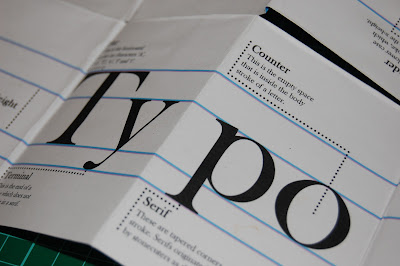
So i decided to alter my booklet a little bit just to make it a bit less dry and a little bit more exciting. I have kept all the useful information inside, and it still looks cook when you look through it page by page. However, i have decided to change the front cover a little bit to make it stand out and want people to look through it. I have also added a nice type and pattern poster in there for the other side which adds a pattern when the book is closed and you can see through, but also folds out into a really cool poster which gives the potential customers a good reason to buy it.

Here is some design stages i took to get to the final piece, then a mock up of the final piece below. I will printing these on nice stock and at a bigger scale, a3, not a4...


Logo Development


Poster Ideas (not final)


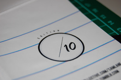
Logo development for the printed edition number on the back. I thought putting this on the back then writing on which number it is out of 10 would be a nice personal touch to whoever is buying it. 


Further Logo Development (for front cover/poster)


Layout Design, ready for print. 


Poster Design, ready for print. 


Close Up 

Below are some photographs of my final mock-up. This is only on really bad, standard printing a4. The final thing will be printing on some nice stock (maybe antique white) and will be twice as big, a3. This will make it look tons better and make the poster have a really better feel to it too...


Comments for this entry

Leave your comment


Copyright 2010. All rights reserved.

RSS Feed. This blog is proudly powered by Blogger and uses Modern Clix, a theme by Rodrigo Galindez. Modern Clix blogger template by Introblogger.