


Using the idea of movement and thinking about how the poster could be more interactive to correspond to the concept of Film, which of course is moving. i was trying to come up with an idea that would appear to be moving put could be reproduced on a large scale that isn't moving.
Poster (Imagery)


original experiments with combing the logo with photographic imagery just to get a feel of how it might work. It looks okay, but needs a much better concept that relates back to my original ideas. These will be good to test with though, I might do some small print jobs to see how the neon stock and black ink work together.
Poster (Famous Quotes)

Snatch

Snatch

The Full Monty

In context
The main concept for the exhibition is to bring in these traditional quotes from films and also using British Humour and Cockney Rhyming slang to try and make the Biritsh public proud of Independent film. These are really simple. Just typesetting along with the chosen colour scheme. It might be simple, but also an effective form of commuicating and standing out amongst a lot of standard advertising used these days.
Business Cards
I've also been working on the branding side of things and how the logo and brand can work across stationary and different elements that might be found in the festival. This could be things like Business Cards, Letterhead, Invitations, Ticket Stumps, Press and Visitors Pass's, Staff Uniforms, T Shirts, Booklets and Publications, Not to mention the Way finding and Maps and Schedules which are something I'll be working on later.


A few different experiments with the business cards, I want them to be fairly simple and let the colour scheme and logo branding to do most of the talking. i as thinking, that if I go with the scattered letters idea that this could work across a set of four or more cars when joined together. This is the route I might take, although I do really like the simple B in the square, which is to the point, but effective.
ID Tags


Moving onto the visitors pass's. Again continuing the scattered text idea. This might not be what I go with eventually but I like how this type of brand starts to work across different elements.
Schedule Book (Front Cover)


These are just some more initial experiments for the schedule book which is another thing that i'll be creating later on. Just an idea of how the brand might work across into publication.
Tickets
Probably one of my favourite products to be creating are the tickets. These are an integral part of the branding and the event itself, as obviously the main thing is watching the films in a cinema environment.
I wanted the tickets to have a traditional feel to them, so thats why I researched into vintage ticket stumps and how they used to be collected in the large reels of perforated paper. This is the kind of look that I would like to go for.


More experiments was in placing the logo within the design of the the ticket, and how this might work across various different tickets, when printed continuously. This above is an idea, but I think it's a little bit too confusing, especially with the clashing colours.

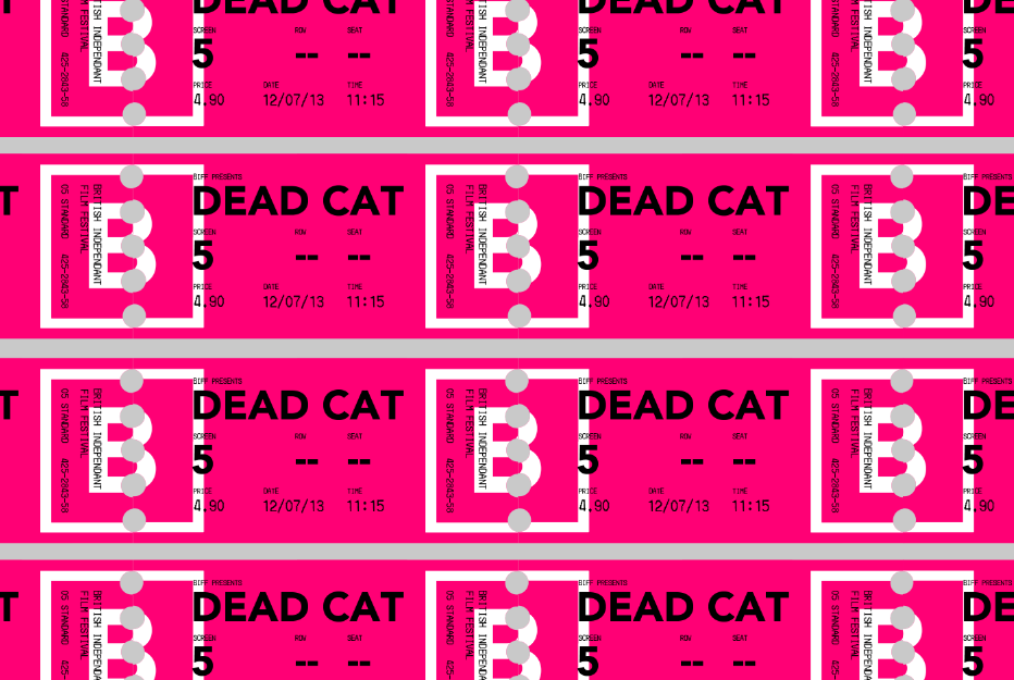
This is a much more solid idea in my opinion. if the tickets were printed in a continuous loop. The logo would be printed across every two tickets with half being on the left hand and on the right hand side. This would create a long line which makes the logo when joined up. This has better thought gone into than the last idea, and think it will look great when printed.
Tote Bags


Just some more mock ups on how the design can be extended across more promotional products such as tote bags. I might have to get these printed or screen print them depending on time issues. I want to use a very neon pink colour which will continue the theme of the brand throughout.
I think my favourite out of these is probably just the first one, or second. I like how the simple logo works on its own, but still has massive impact values.

Popcorn, anyone?
T-Shirts


Again, thinking about positioning and design within t-shirts. I visioned that the staff would wear these type of plain white t-shirts with neon pink print. These could again be screen printed or be applied using t-shirt vinyl.

I wanted to add a slogan to the back of the t-shirts which is lighthearted and would make the public feel comfortable in approaching the staff. This was my original idea...
"We are nice chaps and we are here to help."
It's straight to the point but also quite informal, also making people aware that they are more than happy to help you with any of your needs.

This ones a little bit less obvious...
"We know our onions about film, and we are here to help."
It's playing on cockney rhyming slag and still has that playful tone with it, which would attract people to ask for help most likely. I like the ring of this better, but i'm not sure if everybody would understand it. Nether the less, it makes a bold statement and would make staff stand out in the environment.

This is a bit more understandable and still typically English..
"We are here to help, and we don't mind having a good chinwag."

Trying to apply a more text based saying to relate to the tote bag. This is probably my favourite which I come up with, but might be a little bit inappropriate. However, as most of the films are 15 and 18 certificate, this environment has a much older audience.
"Carry your stuff back to your gaff, with this dirty slag."
Stationary


Mock ups of how the stationary set might work together.

Leave your comment