
_____Anatomy of Meat Words
Rear, Udder, Tail, Pin Bones, Hook & Bone, Back, Withers, Shoulder, Neck, Horn, Face, Nostril, Jaw, Throat, Brisket, Chest, Teat, Loin, Heart, Veins, Crops.
_____Cuts
Rib, Sirloin, Fillet, T-Bone, Rib-Eye, Shank.

_____Anatomy of Type Words
X-height, Cap Height, Baseline, Bracket, Crossbar, Terminal, Counter, Link, Neck, Ear, Ascender, Descender, Loop & Lobe, Axis, Bowl, Overshoot, Tail, Shoulder, Eye.
_____Words that apply to Both
Neck, Ear, Loop & Lobe, Bowl, Tail, Shoulder, Eye, Face, T-bone.
This is a great starting point for me to create some dishes and relate my menu to this, whilst still maintaing to be realistic...
____Brand Name & Logo
I then went on to think about what my restaurant could be called. After some brainstorming of ideas, It all came back around to the most basic option of; Anatomy. I felt that this name related obviously in linking my two topics of food and typography together and it also sounded right when pronounced. It seems to fit the bill for the aesthetic that I want to create and the brand that will fit that.
I could visualise in my head that the 'o' would have a strikethrough like this; ø so I decided to do some initial experiments with typeface that i felt would suit my brand...

Originally, I tried a mixture of serif and sans serif typefaces but instantly felt that the serif fonts was clearly working better as a brand for my restaurant. Didot particularly stood out to me so I decided to roll with that...

I tried a few different variations experimenting with the strikethrough of the line through the 'o' but in the end decided the simplest worked best...

The 'O' can work as part of the identity itself, a logo if you like and then the complete word will make up the rest of the brand. These two elements of the brand can be used on their own and together to help give the brand an identity.


Here you can see how the three elements can work together and on their own.
____Meat Anatomy X Type Anatomy
This seems like a wild idea at the moment but if I could get it to work, it could be a really successful concept. I decided to try and combine elements of the meat anatomy with that of type anatomy.
I started this with some rough mock-ups. I took a cut of meat in the neck and tried to place this over the neck of a lower case 'g'.

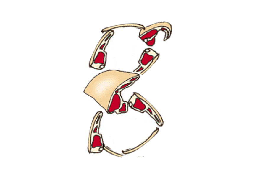

Obviously this is looking pretty terrible at the moment but as an initial concept I can see this going somewhere. I would have to think carefully about how i could combine the two. I could tame down the illustrations slightly so they look more traditional, sort of taken from a Victorian cooking manuel. If I overlay these black and white illustration with blown up abstract shapes of the 'g', this may make for a really nice menu.

I worked into this idea a little further because I wanted the menu to look classy, not tacky. This idea works a little better but i'm still not really happy with it. The diagram of the cut of neck is placed over the neck of the g with the meal information at the side. It's getting better, but still needs a lot of work.

Leave your comment