Book 1 - 4
I have decided that I want my books to be A5 in size. This way, I can have double page spread for each design process or technique.
I also wanted to think about the putting together of my books carefully because I need it to relate to the content.
I wanted to go with an interesting binding technique, and something that I have always wanted to experiment with is the Japanese Stab Stitch Binding method. This seems simple enough for me to do myself and will also let me get my messages across about the content of the book.
I think for the type on the front covers, I really wanted to do something relaating to the print methods such as Embossing, Debossing, Spot Colours, Varnishes or Foil. I figured that Spot Varnish would probably be the easiest, putting the covers through a laminator to achieve the result. I also might look into embossing the front cover as this is something I have had some experience in, so I know it's possible. I think at this stage, Spot Colour is out of the question. i will most likely go with a handmade spot varnish and possibly embossing.
Book 5
My Fifth book will be my swatch booklet. I want the cover and binding method to be the same as the others but this is going to made from samples i have collected from all over. I want to get as many different processes as I can find in order to get a really good reference sample/swatch booklet. This will include, print processes, techniques and stocks.
Initial Design Sheets
PHOTOS
Page Layout Ideas
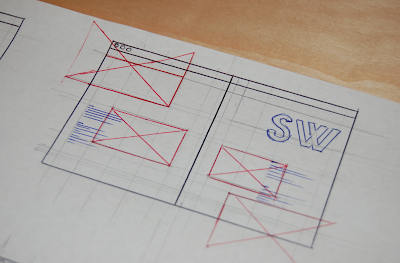
I hope to keep the layout fairly consistent inside and very much to a grid structure. I have experimented with some experimental contemporary layouts. I want to keep it quite minimalist, very structured and also a good combination of type and image to help get the information across.
I also don't want to over face people (or myself) with loads of body copy. I have tried to strip back my body copy and information as much as I can, and hope to have smaller section of text in around the layout and images to help keep the readers attention and also keep it short and sweet, to the point.
As you can see some ideas coming together - the body copy is spaced out and the placement and size of the title is quite large in comparison to the images and type. This ideas seems to work well.
Very Clean structured layout is an option. Keeps it simple and to the point.
More experimental with the type. This might be too over faceing and focussing away from the infomation.
Minimalist approach?
Really like this idea for the context. Stripped back approach and using the number of the book in the series.
Front Cover Ideas
The option of have thermal tape binding or possible Japanese Stab Stitch.
Looking to link the books together as a set both in design and production.
Some ideas for physical production of the book.


Leave your comment