Archives

Responsive - Purple Leaves T-shirt Competition


I decided to create a enter a competition brief for purple leaves which is a T-shirt company based in Germany. I found out about this because one of the designers of the company emailed me saying he liked my work and that I should enter into the next competition which was in a few weeks.

Seeing as he liked my work and was probably judging the competition, I felt like this would be a good opportunity for me to possibly win.

There are no rules to the brief, other than it can be an illustration, photograph, type or a combination to create a t-shirt graphic that will be popular and ultimately sell on their online shop. The winner gets £400 as well as £1 from every t-shirt that is sold online.

Seeing as the target audience was primarily young adults around a similar age to me, I decided to go with a design that would be relevant to the time and pick on certain trend movements at the minute.


I re-visited an old idea of mine which was a Hipster sat on a deck chair covered in tattoos.
I created this drawing originally on trace using an old photograph of my granddad as reference...


So this is the original photograph that I manipulated onto a deckchair as a fathers day card for my dad last year. I decided to use this basic outline as a starting point for my illustration. 


My original sketch consisted of the outline with a different face. I didn't like the first attempt so drew a separate on to the side, I think the facial features, glasses and hair looks a lot better on this one, so this is the one I will be translating to digital. 

I also experimented with different tattoo sketches across the whole body. I'll use some and probably alter others...


I started digitalising my rough sketches into neat strokes and I got the basic outline down then started to add the tattoos. I used other images as reference and tried to keep the theme traditional. 


I added some brogues to the feet again using another image as reference. I then wanted to add some tone to the image so it wasn't a flat illustration so decided to use these half tone like patterned dots and different sizes to make things look darker and lighter. 


I dropped the dots into the background to give the image some definition. 


I then used different sized dots to add further definition to the shoes, shorts and deck chair creating a sense of light and dark tones. 


Placing the image on a T-shirt


I wanted the illustration to have colour for the t-shirt, so experimented with red and blue and felt that blue worked better. I had to remove the background because I felt that the image sat better on a plain white Tee as a stand alone illustration. This was the final outcome I created...


Life's A Pitch - E-Flyer / E-book / Online Presence

____Name & Concept


So we decided to call our agency 'ASSSK'. After a lot of deliberation, we decided to stick with the initials of our names which is;

Abbas, Sam, Sam, Seb - ASSS

We then linked this to the word 'ASSSK' as we felt that this would be a perfect approachable name for people to come and simply 'ASSSK' us what they want.

We wanted to seem professional, edgy, contemporary but above all this, friendly and approachable which is why we feel the name is perfect for us.


For the logo, we had the idea of creating an ambigram which again took us a while to get down some solid ideas for this so that it could actually function and work as a logo. We got together as a group to decided the overall aesthetic of the logo and then Seb wen't away to create the digital version, which works really well and will help give our brand a real identity visually.


____E-Flyer

We discussed as a group of 4 which direction we wanted to take our E-flyer. We all thought that creating an animated flyer would create instant visual impact and this could be used across a number of different platforms. For example, for web, we could use the e-flyer to be placed on blogs and through emails to help raise awareness of our presence.

For the E-flyer itself, we wanted all the elements to be pretty simple and corporate as we are specialising in branding and our target audience is mainly businesses.

I came up with some initial layout ideas for the flyer. We will also be including the logo within this design once Seb has finished completing it and will generate a digital 'moving poster' to help us network.


____Online Presence 


We needed to give ourselves some sort of online presence so we decided to buy a domain name which would also give us an email we can professionally work with. It also gives us the option to host our own website when we get a portfolio and a website put together. 

Our web domain is www.asssk.us and our email is info@asssk.us.

I also set up our behance and twitter account to get our name out there. We can add work to these as we go along and help create a following...


____E-book


I created this issuu e-book with our brand, what we are about and our contact info on so that we can try and use it as a way of getting out name out there. Abbas will be creating the animated E-Flyer version of this which we can pin on noticeboards and send in emails...


____E-Flyer


From this, we all sat down and brainstormed ideas for the E-Flyer. We wanted it to be animated because we felt this was the best way to catch peoples attention. Originally, we liked the idea of printing off a poster and making it fold out to reveal our business but we then felt that if we could approach it in the right way, a digital version of this would work well.

We all knew how we wanted it to look and Abbas created this which is perfectly what we had envisioned in or head.  The poster folds out to reveal our logo, which is an ambigram and can be readable both ways, hence why it is spinning. Then it folds back in and out to reveal who we are and what we do.

We wanted it to be simple, concise and straight to the point and I feel we have achieved this well...


Responsive - Bacardi Brief - Logo Experimentation

I experimented further with some logo designs. I somehow wanted to incorporate the 'XXX' into the design which will bring more of the heritage into the brand and also make the spirit look a lot more approachable for men. 


I decided to take some direct influence from the original look of cuban bacardi. Above is one of the first recorded photos of  Don Facundo Massó Bacardí with his orginal brew of Rum. Eventually, I hope to bring in these elements from the original crates into my original idea of creating a wooden crate for the drink to be displayed in. My idea is to re-design these elements, then create stencils from this, which would be spray painted onto the wood, to give this believable aesthetic of 1863. 


Hopefully, I will use the laser cutter to turn this type into stencils for me to spray paint onto the box. I made a mock up of something that I will want the finished product to look like. I feel this aesthetic will make a really good display for the drink to sit in...


_____Bottle Mock-Ups


Responsive - Bacardi Brief - Cuban Flag / Wood Experiments

I had an idea of incorporating the wooden crate with the cuban flag and logo I had created so decided to mock this up to see if it could work. I liked the idea of the wooden panels making up the lines in the cuban flag so using this as references, I used a few different brushes to create this textured effect onto wood. 


I think this looks a little it tacky but It gives me an idea of what it could look like. I would like to experiment with actual paint on wooden panel to give it a really authentic look and I feel this could be a successful route to take. 


Responsive - Republic Internship - Week Two - Work Diary


____Fabric


Second week into my internship at Republic and I was asked to work on another in house Brand called 'Fabric'. Fabric is aimed at a younger audiences. Teenagers to Young Adults. Aztec Patterns and Illustrative T-shirts mixed with Snap Back Caps, Knits and Backpacks. It's a quite colourful Brand, here is the statement off the website:-


For effortless style opt for Fabric's menswear range which takes inspiration from Pro Green + Rizzle Kicks. It's slogan central this season in logo sweats + tees - accessorise with snap back caps + backpacks to complete the look. For a more layered Fabric Men's look mix shirts with bold aztec pattern knits + wear back with denim or colour pop chinos.


____Brief


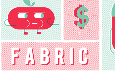
My brief this week was to focus on illustration for t-shirt design. I was specifically given a few images as a starting point for research and was told to follow a similar style but put my own edge on it. They wanted to include 'characters' along with different symbols and items, quite randomly to create a pattern of illustrative elements. 


After brainstorming some ideas, we come to the conclusion of including a few of these items;


- All Seeing Eye
- Dollar Sign 
- Fast Food (Burger, Pizza, Drinks, Hot-Dogs)
- Keys
- Cigarettes
- Snap Back Caps
- Characters
- Etc Etc. 


Using this as a starting point, I began by sketching up a few ideas then mac-ing them up and finally put a few designs together which the head of menswear Simon seemed really impressed with....


From here, I was told to use the t-shirt templates to see how the design could be positioned on a t-shirt if it was gone on to be used as a print for sale...


This is the design that they seemed to like the best. 


Copyright 2010. All rights reserved.

RSS Feed. This blog is proudly powered by Blogger and uses Modern Clix, a theme by Rodrigo Galindez. Modern Clix blogger template by Introblogger.