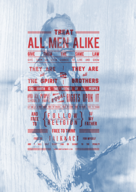
I collected these images of Native Americans from sources online, layered them out and half-toned them. I wanted to add my quote over the top of them as i decided to use 'all that have died are equal'. The images would help re-assure the traditional quote as well as ascetically adding to the piece...


I then went on to create my type, playing around with typography and shapes, i can up with this banner design. Using the colour scheme of red and blue i layered this over the top of the images...


Really like the aesthetic of this piece Should look great in my newspaper of quotes.
I then move onto looking more into type and layout with image. I came up with these results, using quotes i had collected...


Experimenting with more traditional styles of typography layouts. taking influence from stuff i've seen on really old sign paintings and mexican wrestling posters.
I moved onto layering textures and images with the type to help fit the theme and colour scheme...
Working into the type with brushes gave this 'weathered' look i wanted to achieve.


Working into the images to give them texture and more definition before layering the type over for the finished result...


Leave your comment