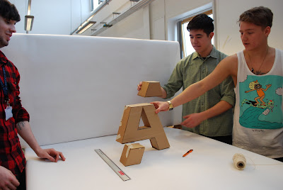
We started on the backdrop, creating this from pure white paper .
Dismantling the boxes ready to be cut up.
Creating and assembling out viewfinder in which we will line up the 'A' with.
Cutting out the shapes for our letter 'A'. We decided to go with a bold capital Helvetica to keep things clear and simple.
Putting together the side of our letter so that we had a fully '3D' 'A'.
We then decided which parts of the 'A' to cut in order to make the 3 different segments.
Once we did this, we then added bottoms and tops to these shapes in order to get 3 solid shapes.
Lining the table with the pure white stock to give a nice studio like backdrop for our shapes to sit on.
Using the viewfinder we lined up the shapes best we could.
The top part had to be hung from the light fittings with string in order for it to sit above the other two grounded shapes.
We matched the two grounded shapes up perfectly then went onto the 3rd floating shape...
This proved to be more difficult and took lots of different trial and error attempts to get the final result.
We got there in the end! the 3 peices lined up pretty much perfectly to create the shape of our letter 'A'.


Leave your comment