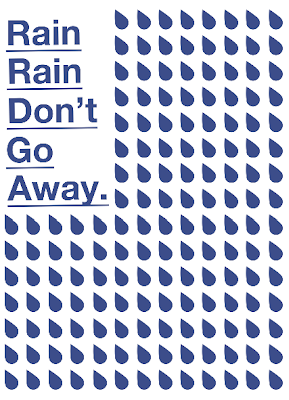
I used the raindrops to create the custom typeface. It's a little hard to read but a good starting point.
I quite like this design with the light and dark blue together. It's pretty minimalistic but is also quite powerful.
Adding in the infomation. I like the design but its starting to look a little bit like an NHS poster or something you would find in the doctors. Not really what i'm going for. It needs to have more class and sophistication.
This design looks like it would be okay for a certain audience but i've got to think carefully about the audience i am appealing to. 'Visitors To The Uk'.


Leave your comment