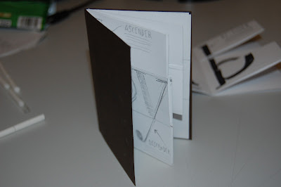
We began by looking at the construction of the booklets. This give us a basic idea of how we can layout our work within the booklet...
After constucting the booklet, i added a card with a greater weight to the front and back to make it a little more proffesional. When this is opened out, it will be on the back of the poster so will fit in really nicely.
I experimented a little and toyed around with the idea of creating my final product based around the anatomy of type! As i had the letter 'A' to work with and also was working under the word 'Lines' i figured this would all tie in quite well.
I had a few different ideas for the layout and how i would go about it. I decided i wanted to place two letters per page to get all of the information in that i may need. I wanted to have the three guide lines of the letters running throughout the whole book.
i also looked at maybe cutting slits into the pages in the middle of the book so that the user can interact with the peice. The different parts of the anatomy of each letter can be mixed and matched with other letters.
I like this idea but it may prove a little difficult to create. This may also go against the whole idea of a hot-dog fold booklet, which should really fold out into a poster on the other side.
I like the idea though so i will begin to create the pages and decide the final format at a later stage. I will be using nice stock also to print on just to add a good finish to an overall nice little product.
The final books will be created from an a3 sheet folded down so that the booklet will be roughly a6 size. They will be sold at £2.50 each at the book fair and hopefully i can get my work out there and make a nice little profit at the same time!


Leave your comment