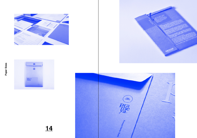
____Process Layout


This is my original layout that I was working on for the first crit. There are lots of positives that I can take from this but also a few negatives. Originally, I wanted the publications to split into 3 and A4 in size. But after further research, I have realised that the publications may work better split down even further. Maybe into 5 or 6 booklets and a smaller size of A5. This would then also fit better into a little box that the books would come in entitled 'the print manuel'.
____Positives
- Sliced Text
- Vertical Text in Boxes
- Red and white. Full page.
- Simple Contents Pages
- Simple Body Copy Layout. Not to experimental.
____Negatives
- Needs to be scaled down to A5 in size.
- Slightly more simplified layout.
- Less Negative Space, Simple Body Copy.
- Heading text could do with being smaller or placed differently.
- Images will work better black and white or full colour rather than red monotone.
___Stock Bind & Cost


Again, from the initial layouts for my Stock, Bind & Cost publication, I feel that it would benefit from being broken down into smaller books. There are elements that I can take from tis to move forward into my newer version of the books. I like the smaller text for the headings. It seems to work better and help the layout and design flow better without being too overpowering.
I feel that the publications would benefit if printed in bright spot colours such as the red and blue, but this is outside of my price range for this particular brief.
___Colour


This is my original A4 layout for Colour and artwork combined. I think that on the whole, the layout itself works well in most parts. The bodycopy is laid out neatly and orderly but isn't too much text to overface the reader. The diagrams are generally quite informative and again, not too much. I need to transfer this layout over to an A5 size, which will mean I will have to change the size of the body copy and therefore the whole layout to an extent. This is a good base for me to work from though. I would like to be a little bit more neat, but interesting with my layouts. The colours will also probably change.
Originally, I wanted there to be three bright spot colours of the red, green and blue in the three books, but after deciding to split the books down further, it makes morse sense for me to keep a wider variety of colours for each book as well as keeping to colours that are available in the CMYK colour mode for easier and cheaper print of the final product.

Leave your comment