Archives

Design Production - Mutton Quad - Progress Crit


____Strengths 


- well thought out idea, you have considered everything.
- engaging design sheets.
- consistent colour scheme works well for the branding of the restaurant. 
- good, in depth, range of mock-ups. 
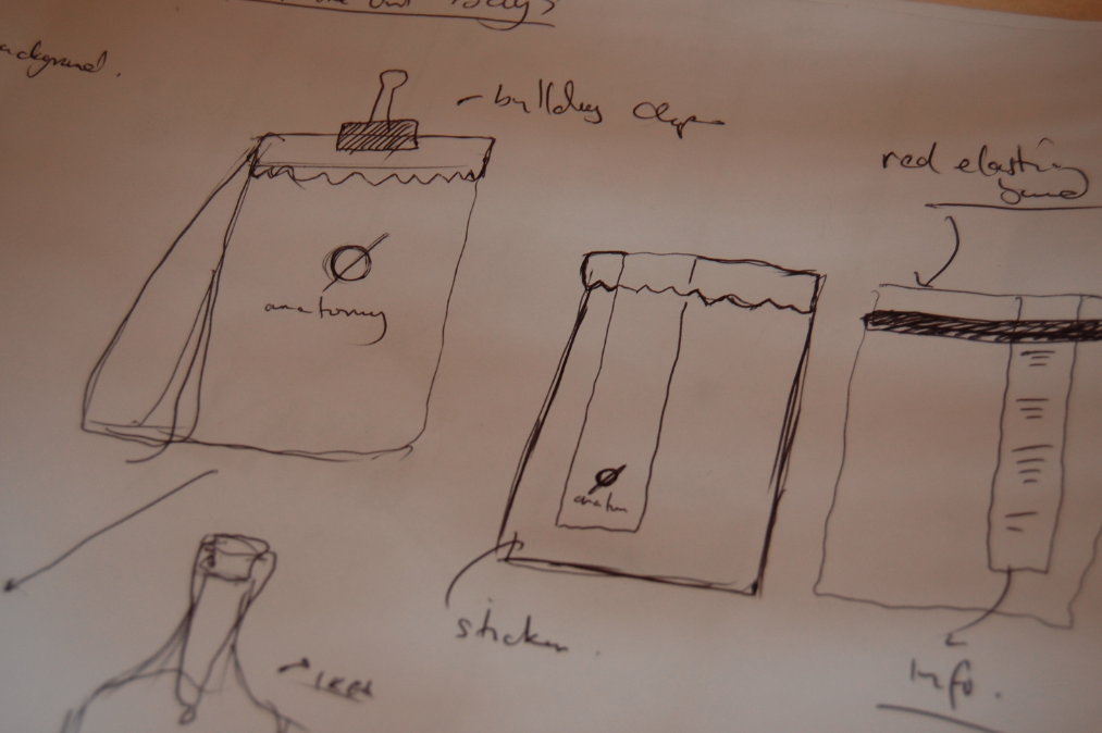
- red stamp idea is great! like the ones you get in local butchers. Feels both rustic and modern simultaneously. 
- nice clean cut colour scheme. simple and fresh aesthetic. 


_____Areas for Improvement

- typeface can get a little bit risky when used at a small pt size. consider using a different typeface for body-copy. 
- maybe add more red! to relate more to food!
- the name 'anatomy' seems harsh for a place you go to eat food. you instantly think of animal anatomy. maybe this is a route you want to go down for shock value?


_____Considerations

- maybe add a touch of red into the receipts, possibly a strip like in some other designs just to tie it in more.
- The symbol 'Ø' is a Scandinavian character meaning 'island'. If the audience was Danish, they would be confused. Consider how you can work around this or maybe use it within the brand?


____My Comments


I'm fairly pleased with the feedback that I received. On the whole, I feel that i'm on the right track. In my feedback the main positives I drew was the simple colour scheme and use of red in particular. The strips of red work across a range of products and channels including print and web and this is the main direction that I will be pushing my brand in. The red stamp again, is something that was popular in my feedback. They seemed to like the idea that it resembled that of a butchers stamp which hits on traditional elements whilst also looking modern and contemporary. I will focus on different areas of my range of products in order to push this idea of tradition in a contemporary dining space. 


Other things to consider personally:-

- Target Audience
- Distribution & Range


Things needed for the crit after christmas:-


- A large body of work, the main bulk. 
- Presenting mock-ups, or even final products.
- A copy of your brief.
- 100% up-to-date blogs.
- Make sure the session reflects 3/4 of your way through your project. 
- Scamps, Stock, Print, etc. 
- Presentation boards.


Design Production - Mutton Quad - Initial Website Mock-Ups

Here are some digital mock-ups of websites I've been working on based on my initial ideas from my design sheets...


Design Production - Mutton Quad - Initial Mock-Ups

I decided to mock up some other products within the identity of the restaurant taking initial ideas from my design sheets...

___Tin Cans


I felt that the greatest and most successful idea for the tin cans would to be create the label from paper to be wrapped around the metal and use the branding logo as a separate sticker to keep this together. I feel this would tie everything together both physically and as a brand. (See Top Design)

Alternatively, I could keep the brand consistent using the red stripe as part of the logo, using this as a sticker around the metal, either vertically, or horizontally. (See Bottom Design)


____Bottles


Some more experiments with the bottle design. I wanted to keep the design minimal in order to let the clear glass bottle of water become part of the dining experience without too much distraction whilst also tying in with the overarching theme of the brand. I initially like the idea of having the logo on it's own in black, with a transparent background, this seemed to work well. 

However, with the introduction of the red 'stripe', I feel that this design may work better, particularly if the sticker was printed on the back of the bottle facing the inside so that you could see the design through the transparent liquid. I thought this might make for a really nice touch. 


_____Take-Out Bag


Keeping with the theme of the red block stripe, I liked the idea of using the rectangle as a sticker which will double up and have two purposes for use. One will be pure aesthetics to match the consistent theme of the restaurant identity, and the other would be to keep the fold of the bag shut and in turn, the food fresh. 

I also toyed around with the idea of including the red elastic band to keep the bag shut but in the end found the initial idea to work best both aesthetically and practically. 


Design Production - Mutton Quad - Receipt / Order Form / Beer Mats

_____Branded Logo


Here, I was trying to come up with some Ideas for my 'branding' stamp. I wanted this to be cut out of a rubber stamp and applied to  the whole range of my products in order to give an authentic look to the restaurant and also relate to the theme of branding an animal, seeing as my restaurant would be focussing on locally sourced produce and heavily on meat in particular. 


_____Order Sheet  


This was my initial designs brought from my design sheets. I wanted the main layout of the different printed products to be pretty minimalist and simple. I liked the idea of using black and white as the  two main colours for the identity of the restaurant, then bringing in accenting colours such as the red stamp, overlapping the black print. 


____Close Ups


_____Receipt - Layout 


____Close Ups


Similar to the order form, The receipt keeps the same layout but is slightly smaller and uses red to highlight the important areas, price, date, table number. 


_____In Context 


The receipt will be delivered on a wooden clipboard and left on the table. There will be an option for the customers to leave money or pay by card and they can slot it underneath the red elastic band which will keep it secure until the waiter / waitress collects. 


____Beer Mats 


I experimented with using photographic imagery behind the logos which didn't work as successfully as I first thought. I think the top ones work better though, and this is a possibility if i can find suitable imagery for them. 


I then moved on to a more stripped back approach. This would follow the theme that I have used in my receipt and order form. Simple, Black, Red and White. I wanted to included the branding stamp with the accent of red so played around with placement of it before finally settling on making the full circle visible and smaller...


____In Context 


Design Production - Mutton Quad - Design Sheets & Further Ideas

I decided to create some design sheets to get down some of the ideas that was going on in my head in to clearer concepts that could be taken to be digitalised. I tried to take into consideration a lot of the elements that i will be creating as part of the identity. These was things like, Menu, Website, Napkins, Take-out Bags, Receipt holder, Receipt, Order Form, Tin Cutlery Holder, Glass Bottles (Tap Water), Beer Mats... Etc...


I had the idea of keeping a black and white colour scheme with the additional accenting colour of red. The red will be used to highlight key areas within the brand and to add a splash of colour for contrast and to help the brand stand out...

I had the Idea of using a red elastic band throughout the identity of the restaraunt. This could be used on bags, receipt holders, the menu, business cards and letterheads, stationery, water bottles, tin cans and anything else where it could apply. This would be practical as well as for aesthetic purposes because it will help hold paper together and help hold paper to a board, bottle or can...


___Receipt / Holder


Two options for the receipt and holder. There will be clear boxes with the description of the meal/drink and the price on the right. There will also be a customer satisfaction form that will be accompanying this. The recipt will come on a wooden clipboard that will be held at the top with a clip and also a red elastic band at the bottom to stop it blowing up. The idea is, the customer will leave the notes of money or a credit card, lodged underneath the elastic band and this will e secure on the table until the waiter/waitress comes to collect it. 


___Order Form / Book


This will look similar to the receipt but will be in the form of a booklet with perforated edge so that the waitress can rip it off and hand it over to the kitchen staff. There will be open boxes where there will be space for the waitresses to write the orders and they will use a red pen in order to match the overall colour scheme of the identity and to help make it stand out in the busy environment of the kitchen. 


___Cutlery / Napkin Holder


I wanted to use an re-cycled empty metal tin to hold the napkins and cutlery. I think the plain colour of the metal with the addition of a red elastic band which would also double up to become practical in holding a tag onto the metal. The label again, could be help with a similar sticker that is used throughout the brand. 


____ Beer Mats


Beer Mats need to be relatively simple. I want to use photographs in the background of the image with the logo and type overlaid above them. As for the shape, I either want to use a circle, to match the logo, or a pentagon. 


____Take-Out Bags


For the take out bag, again, I wanted to use the red stripe that will overlap over the top of the bag, which will be practical as well as aesthetically pleasing. The sticker can also be used to hold down the turnover of the top of the bag, and will add the the look of the product. I also toyed around with the idea of including a red elastic band across the top of the bag to keep it together or even a small bulldog clip. 


____Bottles


The bottle will need to be simple. I like the idea of using the circular 'o' logo on a clear glass bottle to serve the water in, which will be tefillable. This fits in perfectly with the brands identity without being too full on. 


____Menu


I'm still undecided in which way i will take the menu design. I don't want it to look boring but it has to appeal to the correct audience and also has to include elements of typography which was my initial idea. My favourite, however, for the front cover is to keep the red band that will be a sticker on top of stock and will overlap over into the inside of the menu. 


_____Website


Again, I wanted to include the red stip down the left hand side of the website as well as the other branded products of the identity. My idea was to include a full size image in the background of the website with the strip being used as the navigation as well as the logo. 

From here, boxes might pop-up when you click into certain areas of the website like the scamp shown in the bottom left of the image below. There will be elements used in the physical elements of my identity that I will bring through to the website such as the red elastic band and the stamp overlapping areas of type and text boxes. 


Copyright 2010. All rights reserved.

RSS Feed. This blog is proudly powered by Blogger and uses Modern Clix, a theme by Rodrigo Galindez. Modern Clix blogger template by Introblogger.