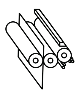
I wanted the illustrations to be all at the same angle so used reference images to come up with my final designs...
Lithography
Rotogravure
Flexography
Thermography
Digital Print
Screen Print
Letterpress
Pad Print
I'm fairly pleased with the results of these illustrations. They all work as a set and are simplified versions of the different print processes, making it personally easier for me to understand and use as reference whenever I may need too.
I wanted to continue the simple theme throughout my publications to keep the style consistent and also to keep it simple and easy to understand as already discussed.
Colour
I then moved onto creating diagrams for all the other elements of my booklets.
I started with artwork and pre-print checks and wanted the diagrams to be really simple so it was easy to understand but without over facing the reader and mainly myself...
RGB & CMYK
I created these simple RGB and CMYK circles by using the blending modes to overlap the colours.
Rich Black
I wanted to show the difference between 100% Key and Rich Black as part of my publication so I created these simple rectangular shapes.
Printer Marks
I used the printer mark as a reference to create this illustrations from. I will place these around my page appropriately to help back up the written content.
Spell Check
Stock
Jpeg & Tiff
Paper Sizes
ISO System
C Series
Newspaper Sizes
Perforating
Resizing / Resolution
True Type
Collating
Trims & Bleeds
Colour Gamut
Resolution
Monotone
Duotone
Colour Halftone
B&W Halftone
I used an image of my grandad to represent the colour within photographs and resolution. This made it easier to use a good quality image and was also something that would fit within the design of my book without standing out too much. It's also a pretty cool photograph so would sit well with my layout.


Leave your comment