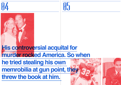
A little bit annoyed that i scanned in the DPS after i put the red lines on but i will have to work with them. I may cut some of the images out to re-create my thumbnail designs.
I will also be using the page before the article as reference so i will merge the title and sub title into my DPS.
I created another 18 thumbnail designs using a blue and red pen. I wanted to continue the style of the riso-graph print through to my actual design and i did this by thinking about it right from my thumbnail designs working in these colours. I then starting putting together a couple of my thumbnail designs in InDesign...
My first effort is simple but fairly effective. I like the use of red and blue colours in order to create the scattered layout.
I then moved onto some of my other layout designs, playing around with hierarchy of type and layout designs...


Leave your comment