Archives

Type & Grid Workshop (3)

Notes


Construction of Grids

Before you can male a grid the idealistic approach is that you need to know what is is for. In Industry you will know your paper size, quality and print methods, before you start making anything. This wastes less time when setting up.

Always start with small sketches, don't design straight onto a mac. Sketch out thumbnails of layouts and placement which saves time when you come to macing  it up, you have a solid design to work with. Easier and more streamlined job of it.


Columns

We've been looking at more traditional grids and column layouts. If you only have one column there is no freedom when it comes to layout, sub dividing columns give you more placement and layout lines to work with.

More opportunities for layout with more columns.

Disadvantages of 6 column systems means that the width will be narrow and may need to have smaller type to solve this. It rests on the function however, so this might be what your looking for.

For statistics, figures and graphs and trend line publications , use 4 columns per page. 4 columns can be sub-divide into 8, 16...., but this get smaller and smaller width so has to be taken into consideration.

The narrower the column, the smaller the typeface.


Thumbnails

Make a variety of thumbnails of layouts and designs. It's important for layouts especially. It's easier to plan out quick designs using margins and columns which can then be quickly transferred to screen, saving time in the long run.

You've got to find the right natural way for yourself to work.


Applying Type to Columns


The first line must fit flush to the top of the column grid The last line must sit on the bottom limit. Keep Calm, it is difficult to get right the first time. It could mean that your grid is too big wide, column widths or lengths.

Alter point size of type and leading in order for it to fit whilst still looking right and being legible and readable.

If the column length is 15cm, this loosely means 15 point leading. Meaning 30 lines of text every 15 cm.

Line your gutters so that the ascender on each word line sup with te top and the decender with the bottom. Therefore when your dropping images in, they will line up to the top and bottom smoothly.


Font Heights 


To find out the point size of the header, take the body copy size and leading, take two lines top to bottom and apply this to the size of the header.


Field Grids


8 & 20 Field Grids - used frequently for advertising and promotion.

Example - The decenders and ascenders fits perfectly into the gutters. Also where, the middle gutter fits into the heading, this is the exact same size as the spaces between the type.

The grid is only an instrument in which you the designer can make interesting and balanced designs.


20 Field Grids - they have got more scope for ideas. There are 42 possible combinations and layout options.

Examples - combinations of layouts.


Always question yourself. Think about aesthetics and structure. Which is more important? and how can use both to the best ability.


Presentation


Task (3 Weeks)


- Make a Concertina Folded document thats no smaller than 5 panels and no larger than 16 panels.

- Take content from a project that your already working with (British Independent Film).

- Apply the Grids and Knowledge you have learnt.

- Challenge the way it's presented, understood. The way you interact and use it. Make it interactive.

- Overlay Grids and use the canon, 8 field 20 field and bigger. Make and Break the grids. Be Creative.

- Think about how you se type and image. Be Dynamic. Don't be Flat or Linear.


Making a Concertina Pattern in Indesign

- Right click the first page in your document and untick allow document pages to shuffle and also allow  selected spread to shuffle.


Initial Design Ideas


Some initial mock-ups. I wanted to go for an unconventional sized concertina booklet and also possibly play around with how the user interacts with the publication. This could be changing the standard portrait to landscape or changing the actual paper size to something unique. 


OUGD503 - Creative Partners - Re-written brief

Re-Written Brief 


The Re-written Brief for the D&AD brief set by  L'artasian Parfumer. This was broke down and re-constructed by me and Chris.

OUGD503 - Creative Partners - Vacuum Forming


Today we managed to get an induction on the vacuum forming machine and create our plastic moulds.

We had to select some plastic which was roughly the correct density that we wished to use for our objects. Then we had to place our wooden moulds into the machine. Then place the plastic on top of it, in the tray. The heat up the heater, place it over the plastic for around 30 second, then tap the plastic to see it had become malleable. When it was, We dragged the heater back away and pulled the lever down, then pressed the vacuum, which sucked all of the air from around the wood.

Once we had done this, we had to prise the wood from the plastic without breaking it then this gave us our moulds.


The tablet package mould was very succesful. It wasn't perfect, with a few creases in the plastic but this was as good as we could get it and would be brilliant for product photographs. We just need to sand this down now and add the tablets and the printed silver paper to the back, before making the packaging for it.


The bottle holder was less successful. For a start, the inside section was a little to bit, and the text on the side, didn't really vacuum properly, leaving a bad take. We will have to re-cut the mould, then re-vaccum to achieve better results for this. But now we know what to do, it shouldn't take half the time it did.


Overall, really impressed with the results of this. We can move forward from here to crete the packaging.

OUGD505 - What Is Good - Concept Crit

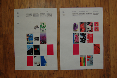
Today I took part in the first Concept Crit for the What Is Good Brief. Here are the design sheets that I took into the Crit.


This was really useful because it gave me the chance to get some vital feedback where I need it. I now realise that I've got a good amount of research about British Film and the reason why I'm doing what i'm doing, but I could do with researching a little bit more into facts and statistics about certain films, especially more recent films. 

I got good feedback about the range of ideas that I had and people seemed to think my concept was strong. I was told that the projection was the best idea, particularly projecting the signage and way finding systems onto the wall. This was good because it relates to film as well as saving on costs because the budget is obviously low in the UK. 

People also seemed to like the idea of using the Bright Pink and Black once I had reasoning behind it and felt that it would be a good way of helping the event stand out, whilst still keeping cost down. 

I just need to get on with more research then start to put some solid designs together in order to progress further...


OUGD505 - What Is Good - Workshop

Words that sum up my good :-

1. British
2. Independant
3. Low-Budget
4. Colourful
5. Cultural
6. Unique
7. Film
8. Festival
9. Exhibition
10. Talent
11. Young / Fresh

6 Most important words that sum up my good :-

1. British
2. Film Festival
3. Cultural
4. Young Talent
5. Independent
6. Unique

6 words that sum up my target audience :- 

1. Young (18-30)
2. Cultured
3. Film Fanatics
4. British / European
5. Creative
6. Independent

6 words that sum up my tone of voice :-

1. Spontaneous
2. Educational
3. Innovative & Unique
4. Promotional / Persuasion
5. Intriguing
6. Humorous (British Humour?)

5 products that I think would be relevant to the brief :-

1. Way finding System
2. Tickets, Schedules, Maps, Wristbands, ID
3. Editorial Brochure / Publication
4. Posters (Promotion) (A2 & A3 & other scales)
5. Website / App

5 processes you are interested in using :-

1. Paper Craft
2. UV Ink / Screen Print
3. Neon Stock
4. Anamorphic / Projection
5. Perforation / Binding

Which of the five chosen themes am I choosing :-

An Exhibition Of...

which is the chosen focus area you are working in :-

Branding & Identity

Which i the secondary focus area you are working in :-

Information & Way finding


Design Sheets Crit Feedback


The main things that I needed to change was the spelling mistakes and the fact that the body copy was the opposite side round to the images, meaning that it was difficult to read which way round the page was. I will need to correct these for tomorrows crit.

The things that people seemed to like as the consistent grid structure of the design sheets, the size of the body copy, the fact that the boards was all numbered, the use of white space and general clean layout, good variation of imagery, and a great balance of type and image throughout.


Refined Brief


Refined Design Sheets


OUGD505 - Design Practice 2 - Photography Workshop

Workshop, Equipment & Set-up


This morning we took part in a re-cap photography workshop. This was really useful because It gave us a chance to re-cap and get to grips with some different lighting set-ups and lenses that might be useful when photographing our work professionally.


Above you can see the infinity curve set-up. This is good to photograph items with a clean white background with no edges visible.


 I used a variety of different tungsten lighting set-ups with diffusers, umbrellas, soft-boxes and reflectors to mess around with how soft or hard the light hits the object and also how the reflector and diffusers can soften this and reflect in back onto the object from the other side, which reduces the harsh shadows.  These were all useful things to know for when we are photographing work.


I also used a few different lenses. The first being the standard lens that comes with the Canon SLR. This is the 18-55mm lens. I also used a macro lens, super macro lens, then added some extenders (shown in the image) to get an even closer macro shot for some of the images.

I shot in manuel and had to play around with the settings to get the images perfectly how I wanted them to look. The main things I altered were the aperture, shutter speed and white balance to get the appropriate images. I changed the white balance to 'Tungstan' for the majority of the images, because I was working with the tungsten lighting.


Photographs


Some images of the Screen Printed potato sack using the regular lens and macro lenses. 


Some photographs of Mikey's magazine using the super macro lens and playing around with lighting and different angles to shoot from. 


This has been shot using the super macro lens. You can even see the colour halftones in the image it's that close detail!


Some more close-ups taken of Seb's lasercut folder


Close-ups picking out the detail in the thread on my hat. 


OUGD505 - What Is Good - Design Boards / Initial Concept

Design Boards


My design boards outline some key areas and starting points for this project. I plan to go down 'The Exhibition of' Route, re-branding a festival for British Independent Film.

The boards outline My Concept, Research, Product Range, Formats and Processes which I plan to use.

OUGD503 - Creative Partners - Making the Moulds

Today we booked another laser cutting slot to re-cut the pieces. This time everything went successfully...


We created the base by cutting out two squares, one with the hole in the middle, then used strong adhesive to glue them together. These pieces were cut out of 10 mm MDF which created a depth of 20mm when glued together. This could be enough to hold the bottle, keep it in place from moving inside the box and also leave enough room on the side to emboss the logo. 


We used 'UHU' to stick the pieces together. This is a strong adhesive that will be solid when left overnight...


For the logo's, we used 3 mm acrylic so that this would not crush like the wood might. It will keep solid clean edges that will give a better chance of a cleaner look when taken into the blow moulding machine. 


I then carefully applied the pieces that were cut out using the 'UHU' adhesive. This was difficult to line up but I had a little bit of time before the glue started to go off. I perfected the logo in a straight line, then will leave it overnight to set properly. 


We did the same for the mould for the tablet blister pack. We stuck on pieces of wood where to pills will sit, as well as the embossed logo across the middle. 


These are now finished so will need to be left overnight to set. We will then need to sand down the edges to create a 3 degree angle on the block of wood. This will mean that when the plastic is blown around the mould, it will be able to slide out easily. 


OUGD503 - Creative Partners - Perfume Packaging Developemnt


Some Development early stages of the Perfume Packaging Design. The designs are heavily influenced by Swiss Style and Pharmaceuticals from the 1960's and 70's. The designs must look minimalist with clean lines and bold colours, to match our original concept with a sans serif typeface. Here I have used Helvetica and Avenir for the majority of the designs, again taking inspiration from vintage packaging.


The main idea is for the customer to instantly associate the design of the packaging with something that is medical. The idea that is it is actually perfume should come after this first initial thought. Most of the designs below are variations for 'Serotonin', which is one of the fragrances in the Phero+ range. Once a style has been selected, we will keep consistancy throughout the whole range, including the swallowable tablets...


Development


You can view the full range of development below via scribd :-


OUGD503 - Creative Partners - Vacuum Forming Development

We decided that we would would use the vacuum forming machine to create the inside of our packaging. We noticed a few bits of perfume packaging that had an insert to reinforce the durability and protection of the glass bottle.

We thought that if we created a wooden mould and then use the vacuum forming machine to make a thin plastic mould that could keep the bottle tight from moving around in the square packaging.

We also decided to create the blister packaging for the swallowable perfume tablets out of the same material do that it fits in with the product series.

We first jotted a few ideas down to see how this could work, before coming up with the final concept solution. We will use the laster cutter to create the wooden moulds, then use this in the vacuum forming machine.

Bottle Holder


We used the bottle to work out the dimensions of the inner square. This was 6cm x 6cm. We plan to raise the 'Phero' logo on the side so it creates an embossed look to into the plastic. 


The bottle is 4.5cm which means with the ridges into the circle, we will have to make this around 5 - 5.5cm wide in order for the bottle to have a snug fit. 


Just a quick three dimensional sketch to see how the bottle will fit into the packaging. 


Blister Pack (x4 Tablets)


We decided to go with four pills in one pack as these are perfume pills, they are much more of a luxury than regular medication which is why we went for the 4 spaced out tablets in one pack. We also used 4 mainly because there are 4 scents in the series. We liked the idea of having a business card sized pack, where the blister pack, slips into a small wallet, as demonstrated above. 


Again, the logo will be raised out of the plastic in the centre of the pack, fitting seamlessly with the other product range and creating an embossed look. 

You can just about make out what I want to do with the back of the packet. We want to print onto sliver foil which can be pressed onto the back to cover the tablets that are ready to be popped out. 


Laser Cutting (Attempt 1)


Chris drew out the vector shapes to the correct size in illustrator whilst I dropped in the logo's I had previously created. We then brought this into the laser cutting program and then cut out the material. 


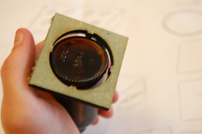
There was two problems with what we had. The first one being we hadn't set the correct depth to cut out, so the wood wasn't quite cut the full way. Also, the inner circle was ever so slightly to small for the bottle, which means will we have to re-meassure and make it slightly bigger for the next session we do this. 


You can see here how the ridges will hold the bottle...


As you can see however, it doesn't quite fit. This will need to be altered.


These are the sections that will be used to hold the pills. 


They will need to be directly glued onto this section of wood, along with the raised logo to create the mould for the vacuum former. 


This is the larger logo that will be used for embossing. 


From this, we need to get the correct pieces of wood and sand this down before moving onto the vacuum forming machine. 


Copyright 2010. All rights reserved.

RSS Feed. This blog is proudly powered by Blogger and uses Modern Clix, a theme by Rodrigo Galindez. Modern Clix blogger template by Introblogger.