I had the idea of keeping a black and white colour scheme with the additional accenting colour of red. The red will be used to highlight key areas within the brand and to add a splash of colour for contrast and to help the brand stand out...
I had the Idea of using a red elastic band throughout the identity of the restaraunt. This could be used on bags, receipt holders, the menu, business cards and letterheads, stationery, water bottles, tin cans and anything else where it could apply. This would be practical as well as for aesthetic purposes because it will help hold paper together and help hold paper to a board, bottle or can...
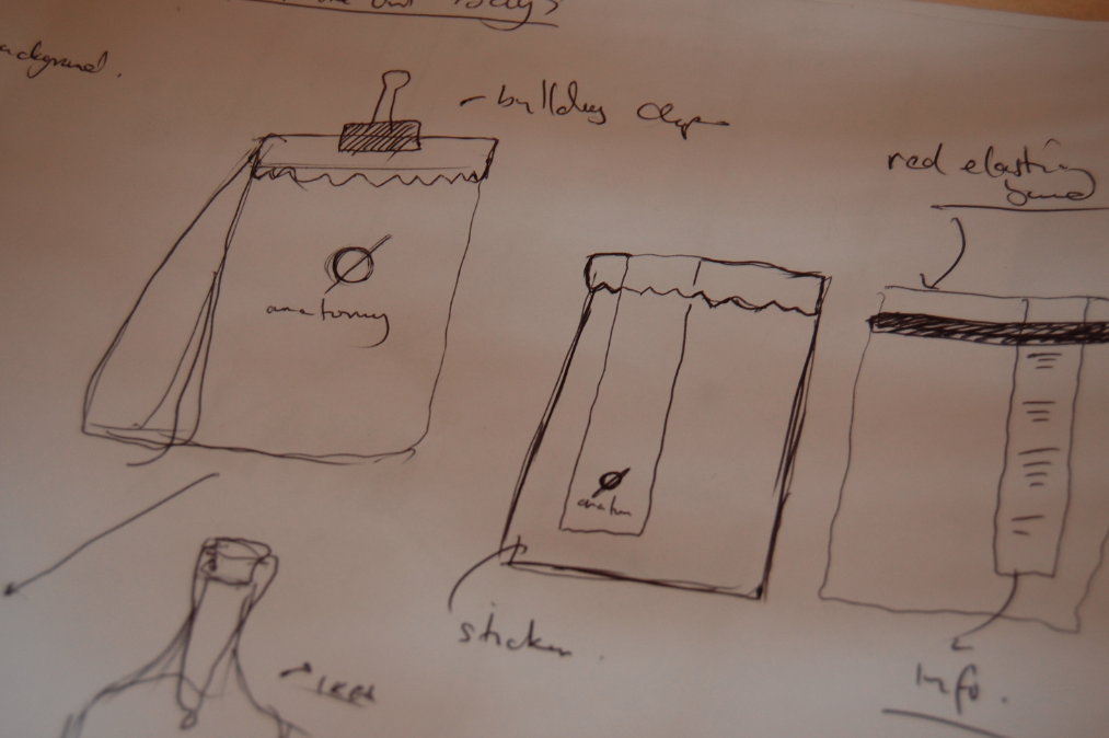
___Receipt / Holder


Two options for the receipt and holder. There will be clear boxes with the description of the meal/drink and the price on the right. There will also be a customer satisfaction form that will be accompanying this. The recipt will come on a wooden clipboard that will be held at the top with a clip and also a red elastic band at the bottom to stop it blowing up. The idea is, the customer will leave the notes of money or a credit card, lodged underneath the elastic band and this will e secure on the table until the waiter/waitress comes to collect it.
___Order Form / Book

This will look similar to the receipt but will be in the form of a booklet with perforated edge so that the waitress can rip it off and hand it over to the kitchen staff. There will be open boxes where there will be space for the waitresses to write the orders and they will use a red pen in order to match the overall colour scheme of the identity and to help make it stand out in the busy environment of the kitchen.
___Cutlery / Napkin Holder

I wanted to use an re-cycled empty metal tin to hold the napkins and cutlery. I think the plain colour of the metal with the addition of a red elastic band which would also double up to become practical in holding a tag onto the metal. The label again, could be help with a similar sticker that is used throughout the brand.
____ Beer Mats

Beer Mats need to be relatively simple. I want to use photographs in the background of the image with the logo and type overlaid above them. As for the shape, I either want to use a circle, to match the logo, or a pentagon.
____Take-Out Bags
For the take out bag, again, I wanted to use the red stripe that will overlap over the top of the bag, which will be practical as well as aesthetically pleasing. The sticker can also be used to hold down the turnover of the top of the bag, and will add the the look of the product. I also toyed around with the idea of including a red elastic band across the top of the bag to keep it together or even a small bulldog clip.
____Bottles

The bottle will need to be simple. I like the idea of using the circular 'o' logo on a clear glass bottle to serve the water in, which will be tefillable. This fits in perfectly with the brands identity without being too full on.
____Menu


I'm still undecided in which way i will take the menu design. I don't want it to look boring but it has to appeal to the correct audience and also has to include elements of typography which was my initial idea. My favourite, however, for the front cover is to keep the red band that will be a sticker on top of stock and will overlap over into the inside of the menu.
_____Website

Again, I wanted to include the red stip down the left hand side of the website as well as the other branded products of the identity. My idea was to include a full size image in the background of the website with the strip being used as the navigation as well as the logo.
From here, boxes might pop-up when you click into certain areas of the website like the scamp shown in the bottom left of the image below. There will be elements used in the physical elements of my identity that I will bring through to the website such as the red elastic band and the stamp overlapping areas of type and text boxes.


Leave your comment