I chose to go with the branding for Urban Outfitters clothing label 'Cheap Monday' and also Manchester's 'The Warehouse Project'...


Here are some images from the designs that I created in the workshop...


Creating the Net Templates
From this point on, I then went away with the task of choosing one of the designs, which worked the best and to move forward with that design to create a range of products on the 4 other nets that I had collected. I chose one and decided to create my digital net templates before I went onto creating the design within the borders.
To go about this, I initially scanned in all of my nets to get the correct measurements and sizes so I could digitally draw up the nets over the images to give me the final outcome. Here is my development of this stage...
The Glass Bottle
Stickers x 3 (Front Back & Lid)

Original Bottle

Scanned in Sticker Nets

I went on to create the outlines of the stickers for the front and back of the bottle as well as the sticker that was on the lid of the bottle.
The American Candy Box

Original Net

Scans with Guides

Using the guides, and lining up the scan perfectly, I managed to created a neatened version of the outline of the net, ready to drop my design chosen design into.
The Tobacco Pouch

Original Net

Scanned Net with added Guidelines

Again, using the guidelines, this net in particular was easy to generate a template for which my dsign can e dropped into at a later date.
The Paper Bag

Original Bag. I realised that this net would be harder to make so I had to measure up and create my own tabs for the bag. I carefully peeled the bag open to reveal the rather straight forward net.

I then used a ruler to measure the surface of the bag and the tabs on the side to get the exact measurements. The size is exactly the same for front and back, placed together, side by side.
Front/Back Square = 25cm x 25cm
Top/Bottom Tab = 2cm
Left Side Tab = 3cm

From these measurements I created a basic net template to create my paper bag. I will have to consider stock when printing this one. The material needs to be really thin, I can even think of using the thin brown paper which is very similar to bag itself, in order to achieve this style of packaging.
The Badge Packet
As my last piece of packaging from the initial task didn't really consist of a net, I had to find and use something else. I decided to use the tag that was used with a plastic bag to hold a badge in it which I originally used for my branding piece. Here is a photo of how the original might of looked...

The net for this was basic so I simply measure out the label. It was two rectangular boxes joined at the middle
8cm x 4cm

I quickly knocked up the outline for this and i was ready with all 5 templates to start designing!
Designing
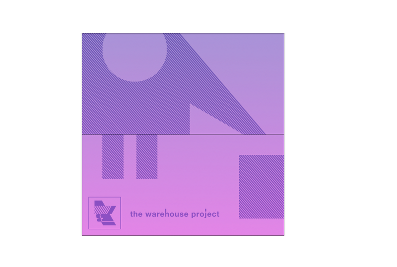
I then started to digitally transfer my chosen design from my initial design sheet. I decided to go with this one below which was taken from the original 'Warehouse Project' Branding. In this design, I made the main logo much smaller in the bottom right hand corner and emphasised the 'Play, Stop, Record, Pause' Media icons that was originally quite small on the branding. I think the simple shapes work well in representing the brand and can be applied well to a number of different style of packaging successfully. i will obviously rework into the design - particularly the colour scheme and background, although i feel that white on black may work well. I will also experiment with the placement of the symbols. I like the idea of this dotted and spaced around effect and feel that this can help emphasise the brand in a number of different format outcomes....
Original Design Sketch


I created the initial shapes by using basic shape outlines. I also got hold of the warehouse project logo from their website. This was the initial branding aspect that I had to include in my packaging. These logos and shapes gave me a good starting point when going into laying my designs out over my templates.

I started to experiment with different colour variations of my original design. I felt that this gradient effect would work well across a whole range of products and also added a little bit of texture with the diagonal lines.

I felt that the white was too powerful against the gradient, So changed it for these cutout effects using the diagonal line texture. I also added the second part of the branding which was the word 'the warehouse project' and this was the result of my first package. My next challenge was to keep the same consistent design but change the layout to fit the whole range of different packaging...
I then started to move around the design to fit the layout of each different net template which I had previously drawn. This was easier than i thought it would be. I had the main components and it was just a case of chaning the layout so that the packaging would make sense when folded up.
Bottle Stickers

Badge Packet
Tobacco Pouch

Paper Bag

Final Packaging

I now had all five different pieces of packaging and experimenting with changing the colour scheme mainly for the fact that i was sick of seeing the pink and purple. I wasn't sure which worked better, so will ask for outside input before making my decision...
i decided that the gradient wasn't really doing it for me, so reverted back to my original idea of just straight up black and white. Here are my finals ready to be printed...


Really nice stickers design, I love last 4 designs very creative.
sticker printing
Leave your comment