Today, we managed to photographed our crafted products in order to get the boards prepared for submission. As our product was very much physical, it was important that we crafted it and photographed it perfectly in order to give it a chance to win the D&AD award.
We felt the concept and design was strong enough, so we didn't want to be let down on the presentation. We created a set up using two lamps either side of the table and a large roll of white paper to create an infinity curve for the products to sit on. This gave us a pure white backdrop with little shadows and no edges or corners...
Full Product Range
We started by photographing all the product range together from all four sets. This give sense of the whole product range and was neatly laid out to fit with our theme. The white backdrop adds an extra medicinal feel to the shoot.
Separate Fragrance Ranges
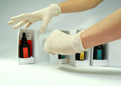
We then moved onto photographing each Fragrance set together and all the individual items with closer shots to get all the detail in. This also helped to show how the user would interact with the product as well as promoting the idea. We did this for all four fragrances to create a consistent shoot throughout.
Other Fragrance Examples
Here is just a couple of examples of some of the other colour ranges.
Boxes & Bottles
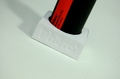
Some Close ups of the Boxes, Bottle and Stands help focus in on some of the detail in the craft and design as well as the packaging of the product.
Testers
We got some close ups of the 2ml syringe perfume testers to show some detail in the design and the syringe itself...
Business Cards
Similarly, of our business cards for the sam reason. You can view the full set of edited images which are going to be used in the final boards for submission below via scribd. This shows all the sets of products and ranges in better detail;


Leave your comment