Magazine One - Telegraph Magazine (Supplement)

DPS One - Another Slice (Interview with Chef)


I quite like the layout of this article. It is fairly simple and focuses heavily on photography. This is probably due to the subject of food and the chefs profile. There isn't too many typefaces going on which is a running theme throughout the Telegraph Magazine. The Telegraph is a broadsheet newspaper which obviously is directed at businessmen/middle class as appose to working class or younger people. The layout reflects this, it is simple and too the point. The information is clear and the layout also is fairly contemporary. Body copy is around 10pt size and is a serif font, easily readable. There are three other typefaces used which also fit well to the running theme of the magazine.
DPS One - A Healthy Catch (Food Information)


There is a little bit more going on with this DPS than the last and i don't particularly like the layout of it. Typefaces used are pretty contemporary and the grid layout is quite clean but also becomes fairly cluttered in my opionion. This time more typefaces are used (12) but they are all pretty similar. There is a sub heading and pull quote which is obviously bigger than body copy.
Magazine Two - Report (Busines/Education)


Again, this magazine is aimed at business people and working professionals so it is fairly formal in layout and typefaces used. This time san serif fonts are used for both titles and body copt which is interesting. COlours used are black and yellow which work well in my opinion for the purpose. It is fairly boring but again just a simple layout for the purpose. Set out in four main columns which agsin is simple, but works.
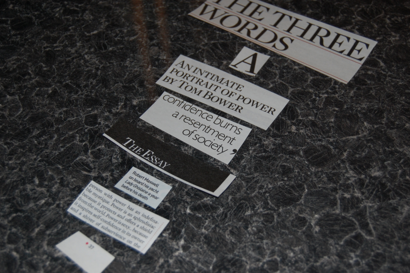
Magazine Three - Guardian Weekend (Supplement)


This is probably my favourite layout of the ones i have reviewed. It only contains two typefaces. Title is bold and sub-title is smaller obvioulsy. Simple type, works brilliantly with the full page photo on the facing page. I really like this supplement, i tend to keep them and us them as referance. This is again, probably aimed at business professionals but i feel that it has more room to be experimental and it definitely a lot more 'design-based' than anything else. Very contemporary in my opinion but also just classically simple so it works well.
Magazine Four - The Sunday Times Magazine (Supplement)


Another supplement that i really enjoy is the Sunday Times Magazine. It is similar in the ways and design styles of the Guardian Weekend. Classically simple, but just works. Typefaces used here, slightly bigger title than body copy as you would expect, placed in the right corner of the photography based double page spread. Works really well and helps draw attention to the shocking subject that the article is about .
Live (Men's Supplement)


Aimed at men, it was interesting to see if anything was different regarding the hierarchy of type and layout but all seems to be similar to the rest of the supplements. There was more illustrations i noticed throughout though, not sure if this relates to anything. Typefaces used on this double page article look quite classic. Serif fonts are used and work well in this case. title is large on the page, takes up a large amount of the left hand page. Pull quote is larger and the body copy is around 12pt and is layed out in a 'newspaper' like fashion. simple, but works.
Flyers
i also dissected another couple of flyers i found lying around. One of them i really like ane one i really hate...
GOOD


This is a nice little flyer for Beacons festival. Good choice of illustration and colours used to help promote the ambience of a festival and it does it well. The festival name is obviously largest here and directly in the middle of the flyer. t is contemporary type mixed with illustration and suits the purpose. All the other type is also quite contemporary and 'in' at the moment. The name seems to be the highest here, then all the secondary information is just underneath. Simple, effective design.
BAD


Design like this makes me sick! The 'bubble' type and the horrific glow around everything suits the purpose of the the terrible nightclub it is promoting. I'm reluctant to say that is stands out, in a way, but certainly not to anyone with any sort of taste. The type is bold and quite difficult to read but there is some sort of hierarchy going on that consists of drink offers being larger and the night 'Friday', being largest. The size also sort of just gets smaller as it goes lower down the flyer.

Leave your comment