Showing posts with label Design Is About Doing. Show all posts

DandAD // Design Is About Doing // Final Poster

After the crit i was told a few pointers on how to improve my poster. I experimented abit further but in the end i went back to the orginal...

One thing i did add was the fifth sense. i realised that it didn't really make sense to have the four senses - Sight, Smell, Touch and Sound. And then leave out Taste. This was something brought to my attention by my tutors, so i added this into the refined version.

I also cleaned up some of the little green and pink shapes that were made from the repetition of the rain dashes. It was said that it made it look a little bit messy so i just deleted the smaller parts to clean up the whole piece of text. This looks much better now. 


It was also said that i should get rid of the small text at the bottom, but i think in context it works well and even if it doesn't need to need to be there, i feel that it adds to the poster. I tried it without but i didn't like it ass much. To me, it felt as if there was something missing.  


DandAD // Design Is About Doing // Final Crit Feedback

Today i had the final crit with four fellow students and our two tutors, Amber and Jo. I really enjoyed this crit as i could speak about my work in a much more relaxed environment and still get some great feedback from the tutors and peers.

I am really pleased that my concept and execution of the main poster got so much good feedback.

Here are some general good points raised :-

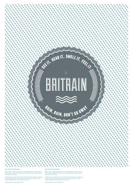
- Really good Concept (Text is readable from afar but not close up. This is to symbolise that people look at rain as a bad thing but if you look closer you can see the real qualities of it)

- The focus on the four senses is also a good idea and works really well with the concept of the rain.

- The optical illusion effect of the text and pattern that also is made from dashed lines to symbolises the rain as imagery. People seemed to think this was quite a clever idea too.

- As the poster is being judged by Erik Kessels, everyone seemed to like the fact that the piece was original, shown my own creative flair, but also clearly influenced by his styles. I thought i was playing it safe in a way, but it has seemed to work out ok for me.

And some things that i could work on:-

- I had only included four sense on the poster. Sound, Sight, Smell and Touch. My tutors seemed to think that adding in the other sense 'Taste' would make sense and i agreed. I'm not sure why i really left taste out but thinking on it again, it would be better to include all the senses.

- The small print about rain at the bottom of the poster. It was brought up that the concept is clear and good on it's own, meaning that their is no real point to have that text at the bottom. I agreed but was a little bit afraid of the concept working without anything else, but with the reassurance from students and tutors i am happy to change this.

- Another point was just to experiment slightly with the composition of the raindrops. At the moment it is in a boxed rectangle in the centre of the poster. I was asked to challenge that convention and move it around, offset it and just see what can make it more intersting. Try and make it without a border, etc...

- Finally, keep experiment with the colours to see which work best for the 'optical illusion'.

I will experiment slightly with these points raised and see how i can improve it any more before i send it off to D&AD. All in all though i am really happy with my final poster design. Fingers crossed that Kessels will like it as much as us lot.


DandAD // Design Is About Doing //Final Poster Prints...

~ Poster One ~


~ Poster Two ~


DandAD // Design Is About Doing // Poster Designs...

I have done some further experimentation with a few designs. I still wasn't happy with my third poster so here are some more ideas that i was working on for the final instalment...


Logo i created just using basic shapes and type. I wanted to stick to one or two colours really. I used the wiggly lines and the raindrop as basic imagery to fit with the whole theme. This looks more corporate then anything, but seems to work well for this purpose too. I'm still not massively happy with it though. 


Favourite one is probably the dark pink colour, this seems to work the best. 


DandAD // Design Is About Doing // New Idea Continued...


Brit-rain


DandAD // Design Is About Doing // New Ideas?

Trying to come up with an idea for the third poster. It's looking similar to the other stuff, again just using type. I'm struggling for ideas but i don't want to just settle for another design like this. I wanted to be a little bit more experimental with the last one...


Messin' with the Britain/Rain idea.


Here, i was playing on the idea 'Rain Is In' This fits with the swiss style which i am seeing a lot of recently. Especially the text round the edges of the page. This would fit in well as it is 'in' at the moment if you like which relates to the statement. I quite like the concept of this so maybe if i play around with it a little more, i could get something that i am happy with. 


Some more experiments i tried to do with the illustration of the umbrella, i'm note really happy with these either so i'll keep working on other ideas...


Colour variations of my final two posters. I will try and get as much feedback as i can on what is working the best before i get them printed...


Copyright 2010. All rights reserved.

RSS Feed. This blog is proudly powered by Blogger and uses Modern Clix, a theme by Rodrigo Galindez. Modern Clix blogger template by Introblogger.