____Fabric
Second week into my internship at Republic and I was asked to work on another in house Brand called 'Fabric'. Fabric is aimed at a younger audiences. Teenagers to Young Adults. Aztec Patterns and Illustrative T-shirts mixed with Snap Back Caps, Knits and Backpacks. It's a quite colourful Brand, here is the statement off the website:-
For effortless style opt for Fabric's menswear range which takes inspiration from Pro Green + Rizzle Kicks. It's slogan central this season in logo sweats + tees - accessorise with snap back caps + backpacks to complete the look. For a more layered Fabric Men's look mix shirts with bold aztec pattern knits + wear back with denim or colour pop chinos.
____Brief
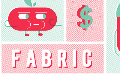
My brief this week was to focus on illustration for t-shirt design. I was specifically given a few images as a starting point for research and was told to follow a similar style but put my own edge on it. They wanted to include 'characters' along with different symbols and items, quite randomly to create a pattern of illustrative elements.
After brainstorming some ideas, we come to the conclusion of including a few of these items;
- All Seeing Eye
- Dollar Sign
- Fast Food (Burger, Pizza, Drinks, Hot-Dogs)
- Keys
- Cigarettes
- Snap Back Caps
- Characters
- Etc Etc.
Using this as a starting point, I began by sketching up a few ideas then mac-ing them up and finally put a few designs together which the head of menswear Simon seemed really impressed with....
From here, I was told to use the t-shirt templates to see how the design could be positioned on a t-shirt if it was gone on to be used as a print for sale...
This is the design that they seemed to like the best.


Leave your comment