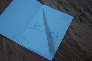
Stocks
For the stock booklet. My idea was to cut every other page diagonally across the different types of stock paper. This way it can give the user a feel of the different stocks up close next to each other as appose to just text and images of the stock. This might be too hard to complete in the time I have. but it is something I would like to eventually achieve. I will also have to get hold of a number of different stocks that I could use.
As for the content, this would just be simple text that could be read across both pages with the stock, weight and informaiton in the top right and bottom left of the pages. (see design sheets for reference)
Front Covers
Here are some designs that I was initially coming up with for the series of books. I want the books to be able to fit together in a series but also stand out from each other for the different content. My idea was to keep the type on each book consistent as well as the layout, but change the colour scheme of each book to fit the particular topic.
I have also thought about size and production. I think that either A4 or A5 is the size i will be going for (more than likely A5) and the biding method will wither be a simple saddle stitch, a thermal tape bind or japanese stab stitch to help follow the content of the book. I want the content to be reflected in the format of the book so this is my reasoning behind that.
Layout
My layout will be contemporary but easy to understand, easy to read and easy to follow. This is one of the main reasons but I don't want the layout to be standard like a regular boring manuel that you can already pick up in a library. I wanted it to be personal to me and reflect the more modern contemporary view on old methods and productions. The information will be cut down to the bare minimum text wise. I want the layouts to be primarily image based so it is easy to understand and not boring. The information included however, has to be substantial enough to be relevant and accurate.
Diagrams
I also come up with some simple diagrams, sketches and illustrations that will give me the basic ideas and groundwork foll all my illustrations that will be included in my books. Again, keeping to the simplicity factor, I wanted my diagrams to be the most basic they possibly can be whilst still making sense.
Vectored Diagrams
Binding
Double Loop Ringbind
Perfect Bind
Plastic Coil Bind
Spiral Ring Bind
Ringbind (Folder)
Saddle Stitch Bind
Screw & Post Bind
Japanese Stab Stitch Bind
Thermal Tape Bind
Folding Methods
Paper Sizes
A Series
North American
Printing Processes
Digital Print
Flexography
Letterpress
Offset Litho
Pad
Rotogravure
Screen Print
So you can see the style that I will be applying throughout my publication, I still have quite a few diagrams and illustrations to create along the way...


Leave your comment