Always choose new Document rather than Book.
Important to select the size of the final printed document that you want to create.
Columns and Guides are there to aid your layout design but have no consequence on the final layout.
Margins aid you to have a consistent empty space around each page which helps fro print.

Bleed is the most important. Anything that goes to the edge of the page should extend off the edge. The reason for this is when it's trimmed down there are no white edges if there are slight trim errors. Always include a Bleed Margin. The common standard is 3mm though.
You should speak to the printer about paper stocks, spot colours and bleed along with the appropriate file format before you start to design. Different printers will have different requirements
The Slug Area is outside the page that will be trimmed off eventually. This is used for trim marks, crop marks, registrations marks and any other printers marks. You can take advantage of the slug area to put in our own trim and fold marks outside of the page.
Specify the number of pages of the document and decide whether to use facing pages. Facing pages is used for when you publication is going to be taking the format of a book.
Start Page Number is if you want the page numbering to be starting on a later page. For example you might not want the front cover and inside to be numbered so that you will start in on page 3.
The Primary Text Frame is checked when you want the text to automatically carry on to the next page. If your pasting in from a long word document then you can easily use this and it will even add more pages to the document if needed.

In the print option you can add your printer marks and also choose wether to print the slug area of your document or not.
The workspace and markings...


Black - Edge of Page
Purple - Margin
Red - Bleed
Blue - Slug Area

Here is the layout of the pages. The 'A' in the corner means the master page. Everything that you put on the master page will appear on all the other pages connected to that page. This is useful for page numbering or sections that contain the same headers or text.
If you double click on the master page located above the pages of your document it comes up in your workspace. You can then add anything here and this will then appear in all your connected master pages.
To unlock a page from the master. You click CMD & SHIFT and then click on page or items and this will allow you to delete them.

You can add another master page by right clicking in the window and clicking 'New Page Master'. This means i can now have another master which will have different elements for different pages throughout the book.

As you can here I have applied the B Master to the front and back page and the A master for the middle pages...
Applying Colour
When applying colour in Indesign it's much like illustrator where it has to be applied to a 'Frame'. It works in the same way. you have a fill and a stroke and can apply colour by using the oclour pallete which looks a lot like illustrator's.

It's important to use the swatch palette in Indesign to apply colours to your work.

All swatches in Indesign automatically work in the 'Global' way which will change all items that are that colour throughout the document, to keep it consistent.
CMD & SHIFT & the bracket keys make text bigger and smaller in Indesign.

Exactly the same as in Indesign when adding a colour swatch, you go into the option menu in the swatch box then select new colour swatch and then choose the colour using percentages. You can also add the spot colour PANTONE swatches into your swatch palette by using the same way as in Illustrator.


It's easier to make colour tints in Indesign. You just click on the colour then go into the options menu and then go onto 'New Tint Swatch' You can alter your colour here then click ok to bring a new tint into the palette...

The only thing you create in Indesign in the arrangements of the elements of your page. Most of your work will be prepared in Photoshop and Illustrator before you then bring it into InDesign. Here are some important things to consider and pay attention to when preparing then before transferring to Indesign.
Photoshop Checklist
1. CMYK or Greyscale Colour Mode
2. 300 DPI - Appropriate Resolution for Print.
3. The image must be the ACTUAL SIZE needed so we don't enlarge in Indesign to lower the resolution. If you make an image smaller it dosent lose the image quality but when turning the document into a PDF it becomes to much work for the software to handle. So make sure all images are changed to actual size in Photoshop before importing it to Indesign.
4. Save file format as a .PSD or a .TIF file before transfering. If you need a transparent background then save it as a .PSD.
Illustrator Checklist
1. CMYK Colour Mode (Make sure none are RGB)
2. Save as a .AI File. But you can copy and paste artwork straight from illustrator into Indesign.
3. There is no resolution in Illustrator so you can change the scale in Indesign with no problems.
Working With Images
When placing the duotone image into Indesign, the PANTONE colours are added to the swatch palette which is useful and important to our final document.

When placing images into Indesign, keep and eye on the links pallete. You should keep all images in the same folder as your Indesign file and never change this or else you will lose images.

You can also paste straight from illustrator. This way, you don't have to worry about linking the files to a folder and it will still add the spot colour pantones to your IndDesign palette.

If I import a greyscale .TIF file, then I can create a 'fake' monotone effect by clicking on the circles in the middle of the image and then changing the colour from black to any colour in my colour pallete. This is particularly useful for if I am using one spot colour throughout my document or only printing with one colour ink.
If i right click the image. I can right click it in Indesign and then go to Edit Original or Edit With to edit the file in another program without having to find the image in the folder. Its a really easy shortcut to alter the image your working with in Indesign.
I can edit the image in photoshop then re-save and it will automatically update in Indesign.

If I want the image to have a transparent background. I can edit this in photoshop then re-save but I have to save it as a .PSD file or else it will not work in Indesign.

I can now overlay this .PSD file in Indesign with a transparent background.
Colour Seperations
If I go to Window>Output>Separations Preview, I can see the colours that are used seperated out in this box...


The original document we are working with has a CMYK image and text and also Spot Colours.

You can see the colours separated when you click the viewing button in this window. You can use this in screen printing to see the separate CMYK layers for creating positives. The Cyan layer would be used to print Cyan and so on. Here above you can see the cyan and yellow together.

It is good practice to delete any unused spot colours from your swatch palette so that they disappear from the separations preview. Then this ay you will know exactly how many inks are needed to print what you need to. You can use this preview to double check that only two inks are getting used. For example if you have been asked to do a two colour print job.
You can view the composite print when you go to Print the document by clicking in the Output box.
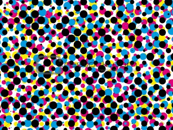
Halftone
A grid of dots which allows us to print a whole range of greys by just using black. the smaller the dots the more white space in between which creates the illusion of a lighter shade. This is useful for printing tints of a colour.

If i'm using CMYK to print, the each colour has to be rotated in a slight way so that the dots don't cross over each other and this creates the famous rosette of CMYK colours on the image.
Overprinting and Locking out
When overlapping images, the colour on top will block out the colour underneath. The standard for CM and Y is that they will lock out each other. Because Black is a dark ink the default for that is to Overprint, On top of other colours.


What is interesting is that we can change how colours block out and overprint. For example, when using a Spot Colour to specify a gloss varnish. The way we do this is choose a colour that isn't used in the document but tell the printer to not print that colour but use it as a spot varnish. The colour will default and block out the colours underneath, but if I need it to be a varnish I have to change this.

To do this I go to the attributes pallete. Window>Output>Attributes. Here there is an option for overprint so when i click this, the magenta has now been set to overprint.
I can overprint the fill this way, but there is also an option to overprint the stroke. this is really useful and it's used to apply a technique called 'trapping'. It is something you can apply to two overlapping spot colours which can help during the print processes. It is an important part about print processes.
Further Research on Trapping

Trapping is a pre-press technique used to compensate for registration errors in lithographic printing and is the process of adding a slight overlap between adjacent areas of color to avoid gaps caused by misalignent. A litho press requires each colour separation to be laid down one at a time over the next in a particular order. In four colour process printing, this order is KCMY or in other words, black followed by cyan, then magenta and lastly yellow. Each plate needs to be perfectly aligned to avoid what we call misregistration.
The exact registration of each colour, or perfect aligning of each plate can be very difficult for many reasons. Colours may become misaligned and overlap incorrectly giving the appearance of unwanted colours or paper may show through in places there should be print. Pictures and type may appear out of register and the final printed product can look unsightly. Therefore, trapping is neccessary to allow a certain overlapping tolerance between the colours to eliminate these problems.
Here, The four colours are not sitting correctly with each other and the white paper is showing through in places.
Misregistration in the graphical workflow may be caused by a number of reasons:
- inaccuracies in the image setter
- instability of the image carrier, e.g. stretch in film or plate
- inaccuracy in the film to plate or film to film copying steps
- instability of the press
- instability of the final media
- human error
These inaccuracies are inherent to the graphical production process and although they can be minimized they will never completely disappear - any mechanical process will always show some margin of error. The small gaps showing up as a result can however be hidden by creating overlaps between two adjacent colors.
Overprinting
Overprinting is the simplest of trapping methods. If something is set to overprint, the colour beneath remains untouched and the colour that sits on top will print over this – when this happens with a light “top” colour, this can cause unexpected or unwanted results. However it is usually a safe setting for black type, as 100% black type will only apear slightly darker printed onto most coloured backgrounds.

Notice that the colour of the cyan star changes when overprinted onto magenta.
Knockout
If an object of one colour sits on another colour, the bottom colour will knockout, leaving a hole or cutout of itself in the colours/plates beneath. This happens with Pantones too.

The cyan star has been set to knockout, so it leaves a hole or cut out of itself on the colours/plates below.
Choke
If the background colour is lighter than the colour in the foreground, the lighter colour is extended under the darker colour. This is called choke.

Notice the cyan colour does not change but has a darker outline where the magenta overlaps beneath
Spread
If the background colour is darker than the colour in the foreground, the lighter colour on top is extended over the darker colour. This is called spread.


Leave your comment